How many of y’all have ever taken the digital images you received from a professional photographer to get printed at your friendly drugstore, and when they came back the color was off, or things seemed a little less sharp? Hear me when I say, not all photo labs are created equally, and where you print your photos is just as important as who takes them.
Why Professional Prints?
Many professional photographers do not allow clients to print their images just anywhere. They don’t give out a print release, and often require prints to be purchased through their studio. Believe it or not, it’s not to squeeze every last penny from their clients. Rather, it is to preserve the photographer’s reputation, and reputation of the product they sell. When a client prints professional images at a drugstore printer, the full quality of their work is not displayed as it was intended. Poor quality prints look poorly on the photographer, which discredits the reputation of the product they sell. And in today’s cut throat competitive market, reputation is EVERYTHING!
Not only that, photographers want their clients to have the best images, printed on the best paper from the best printers. Professional printers cost a little more than your local drug store, but trust me when I say… the difference is substantial.
This blog is not about trying to convince you to order prints through you photographer, but rather to give you a simplified explanation of why it’s important to use professional printers for your professional photos.
Let’s Go Over Some Basics
There are a few factors to consider when choosing a printer. Resolution, color management, sizing, and paper quality are key to getting the best quality prints.
Monitor Calibration
For starters, professional photographers should have their monitors calibrated correctly, which is essential to getting consistency across the entire process. Monitor calibration ensures the monitor used to edit an image, matches an industry standard, so color, contrast, and brightness are the same in print as it is on screen.

Understanding Resolution
Resolution is an important part of printing your images. When a client picks out their package from VBP, they receive high resolution digital images. When we talk about resolution, we are talking about PPI, or Pixels Per Inch. Pixels are the smallest unit in a digital image. Pixels contain the information for images, so an image with a higher PPI has more information, and an image with a lower PPI has less information.
An image that has 72 PPI, has only 72 pixels in any giving square inch, while an image with 600 PPI has a whopping 600 pixels in each inch, resulting in a much clearer and sharper image.
To give you an example, when you get your proofs gallery from VBP, those images have 72 PPI. They are low quality images, because they are created for the web only, not for print. When you get your final gallery, those images are high res, somewhere between 300 and 600 PPI.


In terms of printing, professional printers sometimes require images to be upwards of 600 PPI, resulting in higher quality images. The bigger the image, the more PPI you want.
Color Management
Color is a physical property of light, which means it is basically how our brains interpret light. If there is no light, there is no color.
Fun fact: trying to explain the physics of color to a 7 yr old is as difficult as trying to explain why too many cookies isn’t good for you!
One of these days, I am going to write a blog just about color, if my brain doesn’t explode during the process. But for now, let’s focus on what color is, in regards to your photos and printing them.
Color Profiles
We view our images on many different devices and through different softwares and programs. The camera when I take photos, Lightroom when I cull, Photoshop when I edit, my CRM site used for uploading galleries, the professional printer I use when I order prints, the monitors used at the printer I use, and the printer used to make the print, all have a color profile. Each time an image is viewed through a different apparatus (for lack of a better term) inconsistencies in light and color can occur, depending on the color profile of the device being used.
A color profile (aka, ICC profile) is a code that ensures the colors are consistent across all devices and locations.
Any of you Hitchhiker fans? You can think of a color profile as kind of like a Babble Fish.
Or, remember the game telephone? Everyone sits in a circle and one person whispers something to the next person, then the next, and so on, until the last person says the whispered message out loud. It is usually NOT the same message as it started as.
A color profile ensures the message is the same, each time it is viewed.
There are many different color profiles, and they are all pretty close in comparison. But “pretty close” only counts in horseshoes and hand grenades, right? Display P3, ProPhoto, RGB, and CMYK, are among the most widely used.
In order to maintain color consistency from edit to print, it’s good to edit in the same color profile as your printer.
Now there is color space, which is the spectrum of color that a color profile extends to. CMYK captures less of the color spectrum than RGB. I use RGB, or Adobe RGB, which is also what my printer uses.
Everything I do from beginning to end is done in the same color profile.
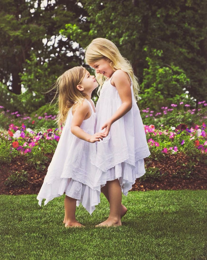
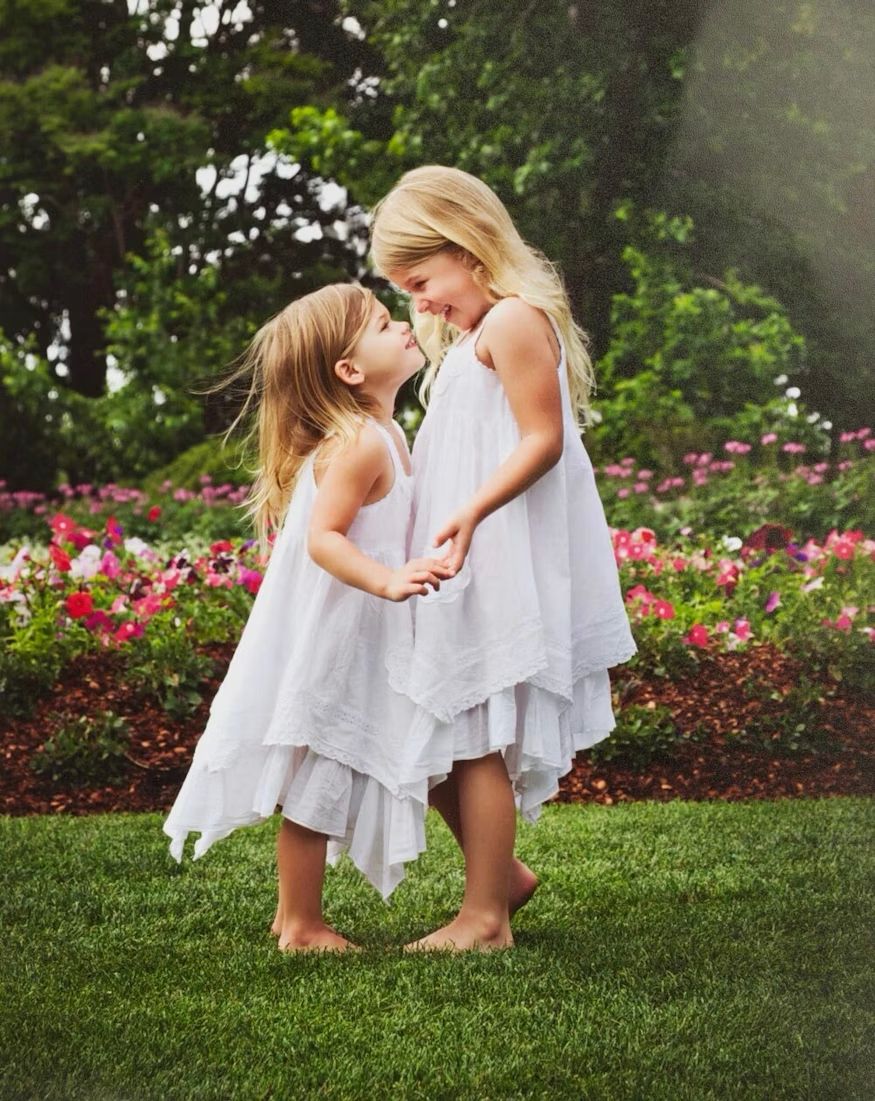
Take a look at the images below. Can you see the difference in each image?
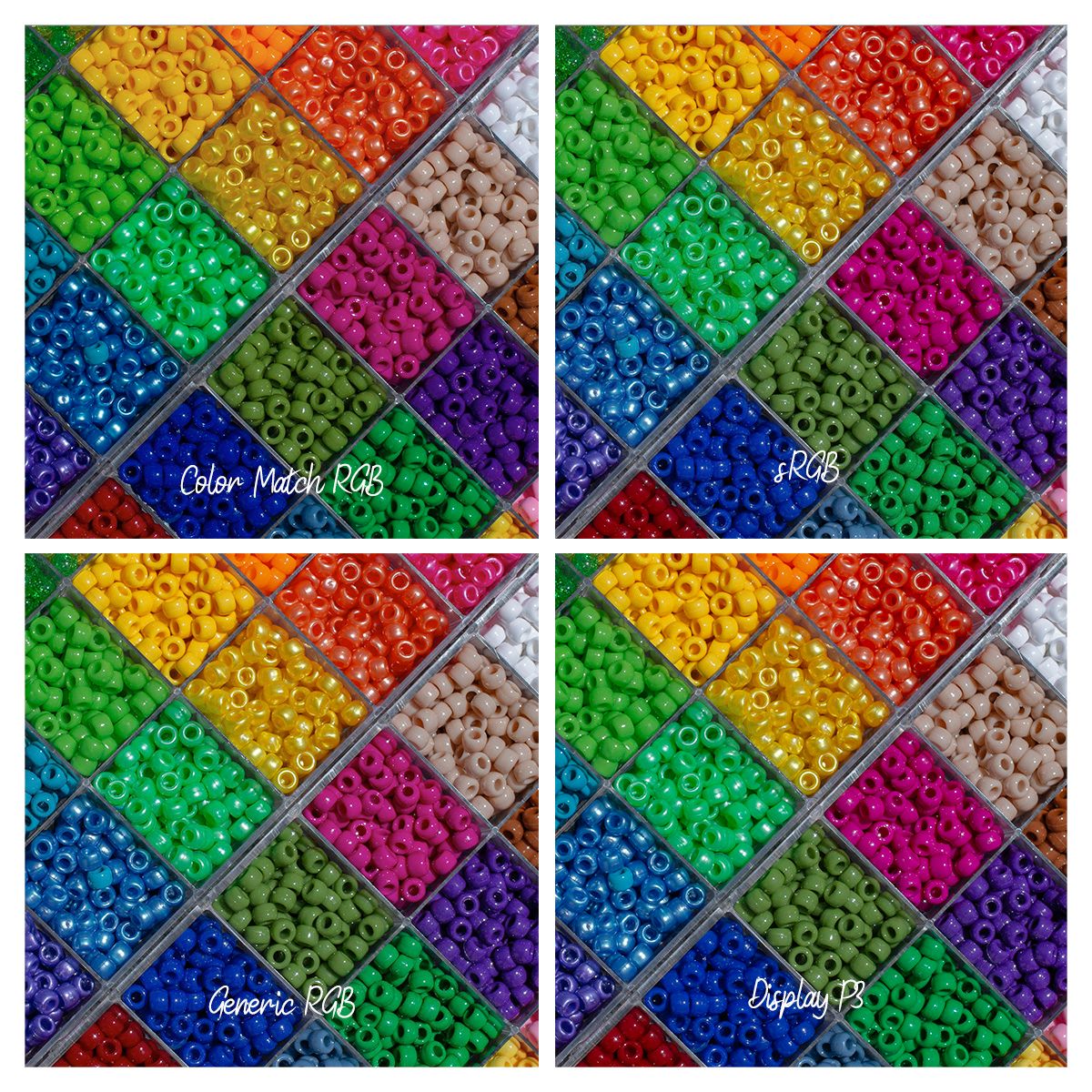
If might be hard to see the difference in these four photos, but look closely at the blues and purples. This is where I see the most variation in prints from different places. Now you might be thinking, that differences is not too bad, not too noticeable. But this is just the variation within one device, and just how it was exported from my editing program, and has not been sent to the printer. This is only one stop in the print process.
Print Sizes
Cropping vs Resizing
When an image is cropped in the process of printing, through a drugstore printer or online printer, the integrity of the image is changed. This is because the information in the image is altered. Information is cut out or stretched in the image, making it pixelated or blurry.
Resizing an image is different than cropping. When photographers resize an image with the applications they use to edit, they are not just cutting out information, but rather adjusting the information to fit correctly in the new size. This alters the size but not the integrity of the image.
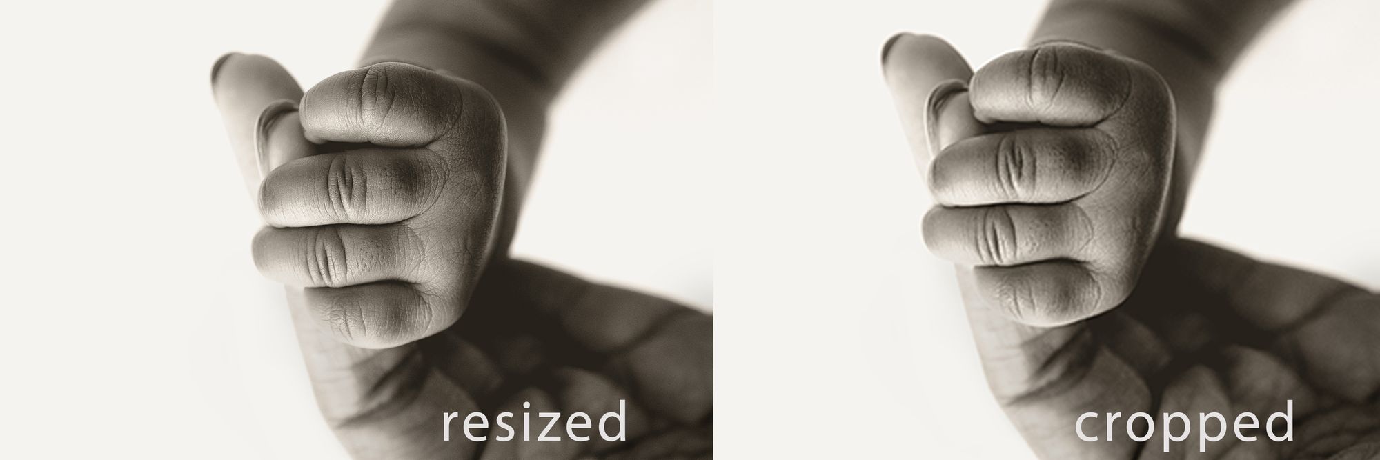
The example above is an example of a resized image verses an image that has been cropped. You can see the resized image has more clarity and sharpness, and the cropped image is a little pixelated and less clear.
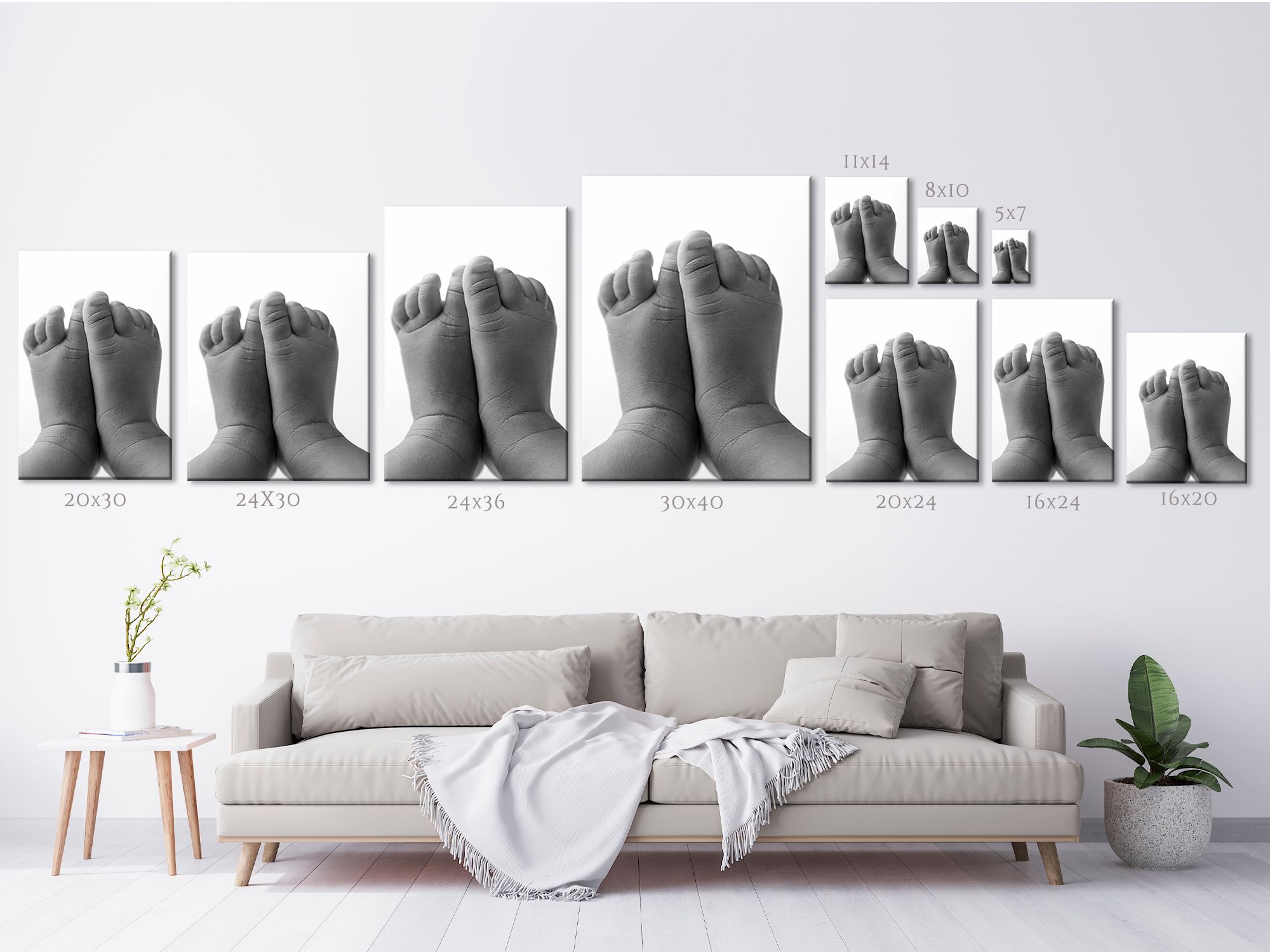
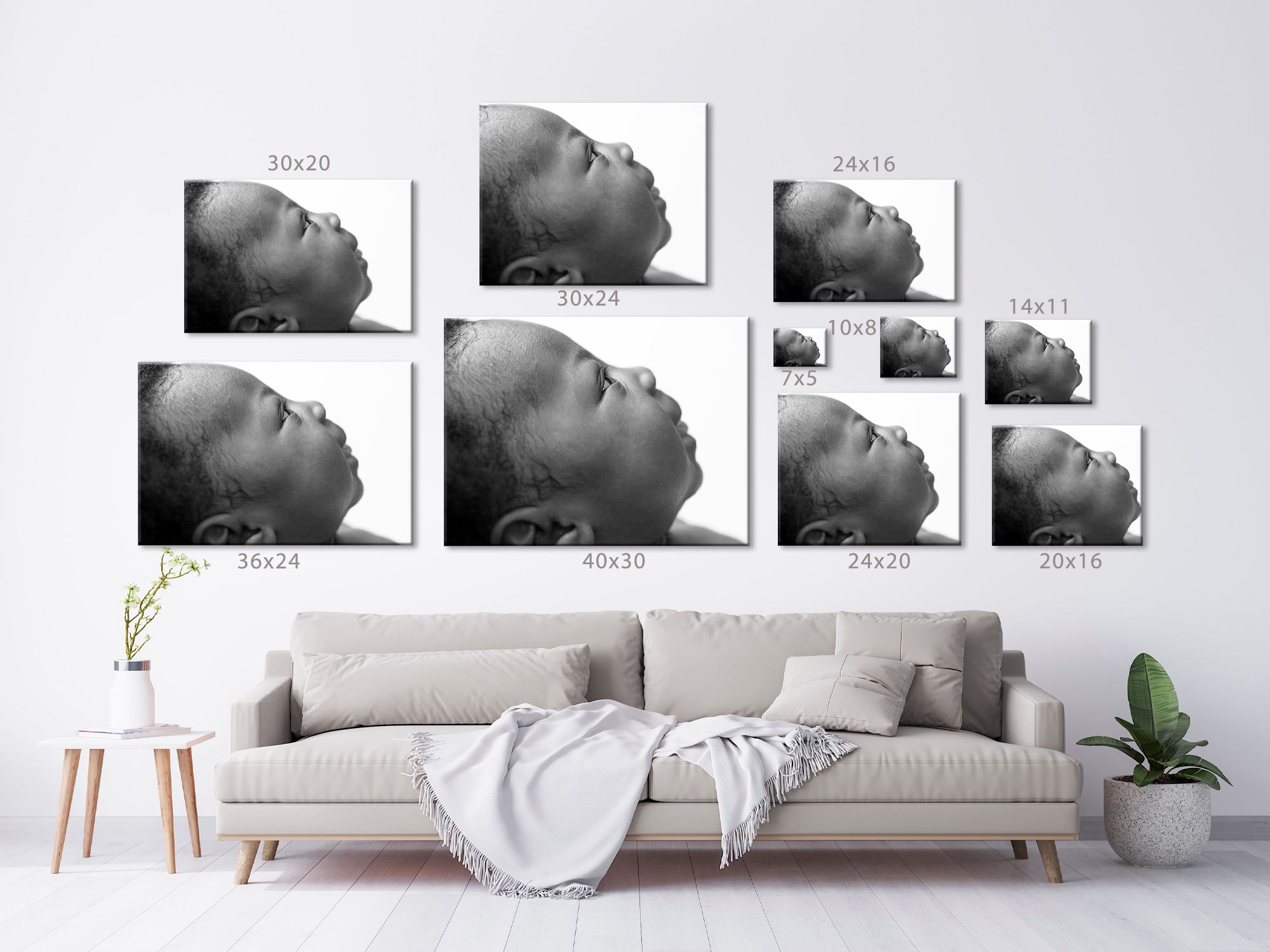
Cropping also changes what is actually in the parameters of the photo. Different crops allow for more or less data to be available. For example, a 5x7 photo has different dimensions as an 8x10. Look at the examples below, and notice how much of the image is cut off for different crops.
Paper Quality
Figuring out which type of paper to print your images on can be a little overwhelming. It’s hard to see the paper quality online, or on a computer screen. Here is a breakdown of the different types of paper found at most printers.
Glossy Paper - This type of paper offers vivid colors and a smooth and soft surface. It’s flat, which allows for a nice reflective quality to the image. Most drug store printers offer glossy prints by default. The advantage to using glossy paper is the vibrance of the image, as the colors are often bolder. The disadvantage is the shine. Because it is an ultra smooth surface, it can be difficult to reduce the glare on glossy paper.
Matte - Matte paper offers a more muted look with a slight textured surface. It’s not glossy or shiny, as the texture in the paper disperses light instead of reflecting it, creating a moodier look to the image. The advantage to using matte paper is the depth of the image you get. There is no shine, and the images are a little sharper. The disadvantage is the colors can be a little bit duller. And, if your photographer edits with a matte style (such as myself), matte paper can dull the colors too much.
Lustre / Luster - This type of paper is a unique style of paper somewhere in between glossy and matte. The texture of the paper is just enough to maintain vibrance and create depth, while reducing shine and reflection. Lustre is my favorite choice of paper, and what I edit for. It works best for my matte style of editing, allowing for enough shine for vibrant colors and depth, while muting it enough to show mood and emotion.
The images below are the paper types used at the printer VBP uses. You'll notice the glossy paper has just a bit of texture to it, which reduces some of that glare you get from most glossy photos.
I don’t actually offer matte paper in my store, only because I already edit in a matte style. Printing matte photos on matte paper can sometimes mute the colors too much. I shoot and edit for lustre paper.
To Wrap Up...
In conclusion, you hire a professional photographer to document the most important moments in your life; weddings, birthdays, the birth of a new baby, etc. Your photographer wants to give you the best quality and the best full service experience from start to finish. Your session doesn’t end until your beautiful prints and products are visible in the way they were intended to be.
Compare this to any other industry, or special something. You would not expect to order at $200 bottle of wine and have it served in Solo Cups, nor would you expect a $100 steak to be served on a paper plate. When you spend the money to get a fancy meal, you expect that meal to be presented to you in an attractive way, as it is part of the fancy experience. Part of the experience of hiring a professional photographer is getting professional prints. It is worth the extra cost, and you will see the quality and value for generations to come.
If you have any questions about printing, ideas for place to print, feel free to get in touch. Click on the button below and let's chat!